

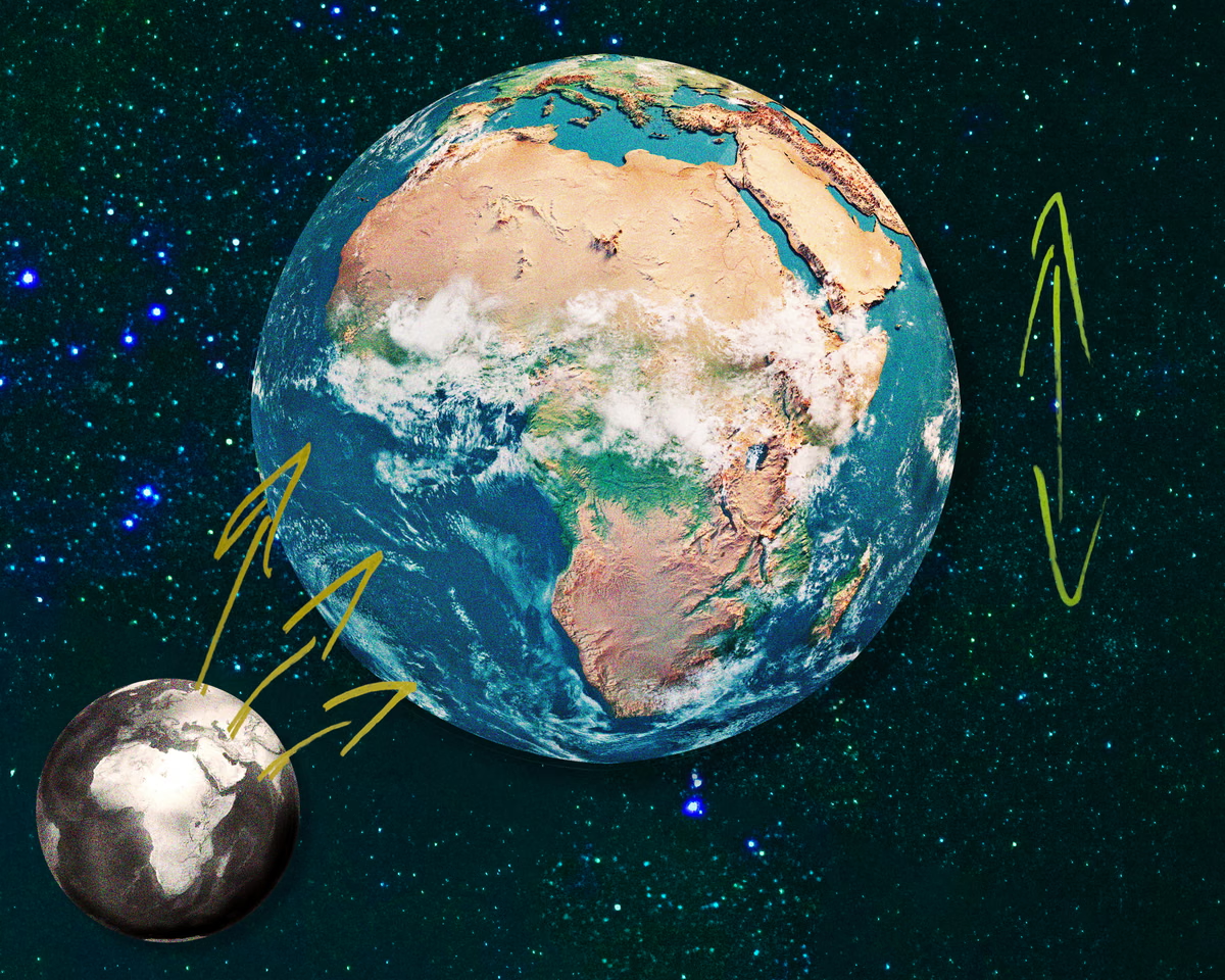
The United Nations has passed a resolution, spearheaded by Togo, to phase out the conventional Mercator projection in favor of maps that accurately depict the real size of global territories. For centuries, the standard world map has distorted geographical proportions, with Africa suffering the most significant reduction in perceived landmass. The proposed shift toward the “Equal Earth” projection is intended to reflect the continent’s true scale, which is roughly double what is currently represented on traditional classroom charts. While the move is technically a correction of scientific inaccuracy, it has ignited a broader conversation about how geographic representation shapes global perceptions of power, stature, and historical influence.
Eromo Egbejule, a correspondent focusing on West Africa, notes that despite the mathematical disproportionality of the old map, the proposal faced notable resistance. The United States was the sole nation to veto the UN resolution, while six others abstained. American officials dismissed the initiative as “superfluous,” a term Egbejule interprets as a veiled critique of the effort as “ideological” or “woke.” He argues that this reaction is disproportionate, noting that the discussion is fundamentally scientific rather than an attempt to impose a new order. For many, the resistance reveals an underlying anxiety about maintaining a connection between the inflated size of dominant Western powers and their perceived status on the world stage.
This geopolitical tension was famously illustrated by Donald Trump’s interest in purchasing Greenland. The former US president reportedly viewed the territory as “massive,” an impression fueled by the Mercator projection, which falsely depicts Greenland as being roughly the same size as Africa. In reality, Africa is approximately 14 times larger than Greenland. This distortion contributes to a narrative where countries like the US, China, and Russia are portrayed as behemoths, despite the fact that all three could fit within the boundaries of the African continent with room to spare. Egbejule suggests that such inaccuracies reinforce long-standing, subordinating cultural and political associations established during the colonial era.
Although the UN resolution is non-binding, advocates see its passage as a significant catalyst for change. Drawing on pidgin proverbs—suggesting that every great journey begins with a small step and that small gains accumulate—Egbejule views this as part of a larger push toward a multipolar world order. This effort follows a separate landmark resolution that recognized the transatlantic slave trade as a crime and advocated for reparations, also an initiative driven by African leadership. These interventions signal a growing trend of utilizing international institutions to challenge dominant Western interpretations of history and reality.
The debate extends beyond mere cartography into concerns about the potential for future changes in education, including calls to decolonize curriculums. The unease felt by some opponents stems from a fear that correcting the map could open the floodgates to a wider re-evaluation of Western narratives. Advocacy group Africa No Filter, which has supported the campaign, highlighted the stakes by asking a pointed question: if the world accepted a fundamentally incorrect depiction of Africa’s size for over four centuries, what other historical and geographical assumptions have been taken for granted without question? In an era increasingly shaped by fractured realities and digital manipulation, the push for an accurate map represents a vital effort to reclaim a shared, verifiable truth. The report also notes that and why people feel so strongly about it, i spoke to our west Africa correspondent Eromo Egbejule about his extensive reporting on the map changes. The report also notes that seeing the new map transposed over the old might make you feel oddly disoriented. The report also notes that logically, there is absolutely no immediate tangible impact on one’s life that comes out of knowing that the entire top part of the northern hemisphere is so much smaller than you were led to believe. The report also notes that and yet, there is still something agitating about it, like you’ve been the subject of a lifelong trick, or at least a breach of trust. The report also notes that and the relative expansion of North America and Eurasia, the vast geographical inaccuracies of the old map include the shortening of Africa. The report also notes that the new projection shows Africa as taking up almost double the ratio of total land area shown on the map. The report also notes that portraying some countries as not just political and economic powers, but geographical ones as well, and therefore natural hegemons, it all feeds into a sense that there is something domineering about it.